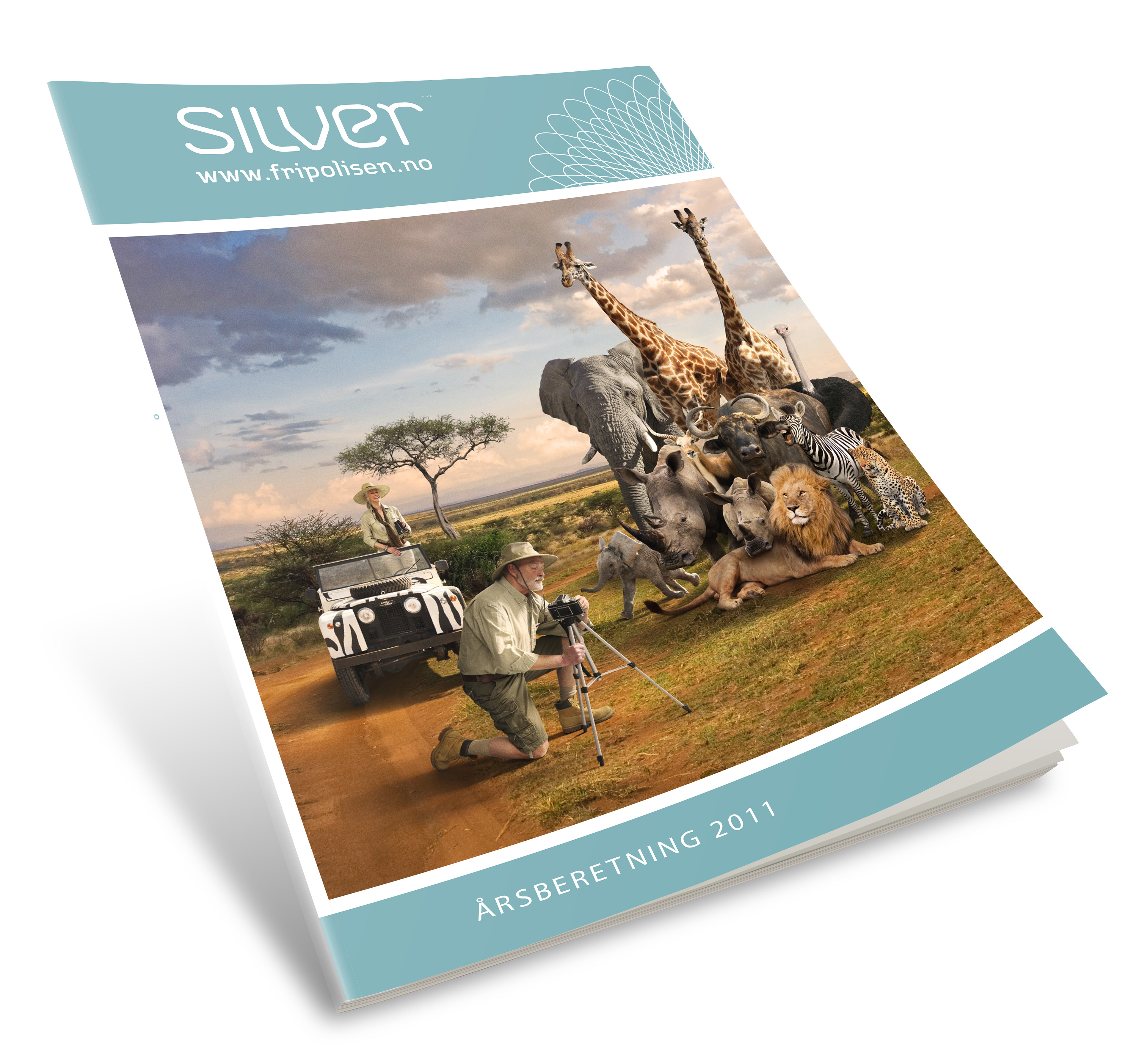
Silver Insurance
Corporate identity. Name and design for Norwegian insurance company
SILVER. The company´s basic business idea is to increase net asset value on paid-up policies - the silver for future rainy days. Most people look upon insurance the same way as having a bank account. Insurance is something we are used to rely on. Silver's name and visual identity uses associations and known features from the banking and insurance sector to create peace of mind and facilitate recognition. The identity has been awarded a Design Effect Award by The Norwegian Design Council.

Up-to-date innovative values were also added. The identity reflects a strong, dependable challenger to be linked up with the name and the target group, and included into every element from signature to pattern, colours and typography.
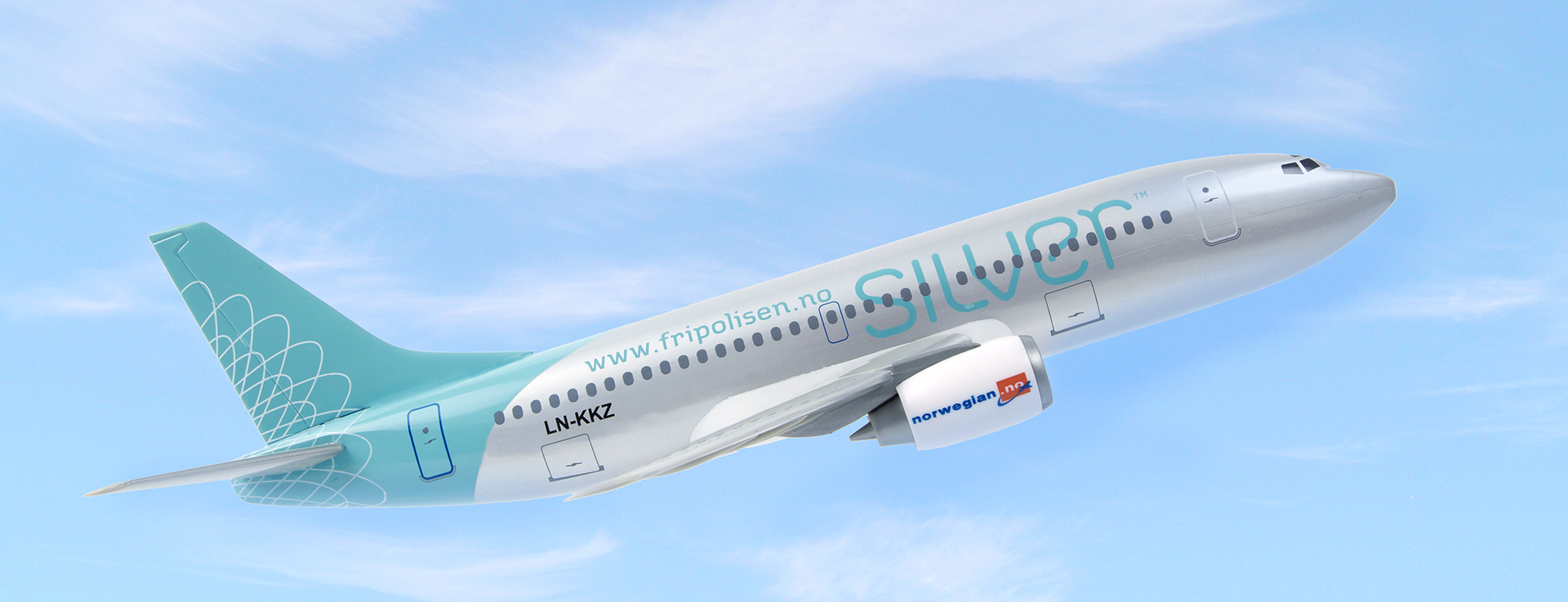
Logojet. Norwegian Air Shuttle ASA ,trading as Norwegian.no, is the worlds fastest growing airline, the third largest low-cost carrier in Europe and the second-largest airline in Scandinavia. They found "brotherhood" in Silver, being an equal challenger to establishments. Therefore, they gave Silver a most welcome opportunity to visually dress up one of their Boeing 737´s with the Silver identity.